When investors look at a stock’s valuation, the price-to-earnings ratio is almost always the first number they reach for. It’s intuitive, widely reported, and deeply embedded in the language of financial markets. But the P/E ratio alone can be genuinely misleading. A stock trading at 30 times earnings might look expensive compared to the market average, but if that company is growing earnings at 30% annually, it could actually be undervalued.
That’s the problem the PEG ratio was designed to solve. And it’s also the problem that the core valuation formulas inside FAST Graphs were built to address, in a way that makes the data easy to visualize, dynamic, and far more actionable than any single number on a spreadsheet.
The Price/Earnings-to-Growth ratio adjusts the traditional P/E ratio to account for a company’s earnings growth rate. The formula is simple: divide the P/E ratio by the earnings growth rate. If a company trades at a P/E of 20 and earnings are growing at 20% per year, its PEG ratio is 1.0. The same company at a P/E of 40 against the same growth rate, and you’re looking at a PEG of 2.0.
Take a look at the screenshots of Coke and Visa in 2010. Both were trading at a P/E around 19 but Coke was growing EPS at an average of around 7% per year while Visa was growing EPS at an average of 25% per year.
Coke had a PEG of almost 3, while Visa traded at a PEG of under 1.
From 2011 - 2019, Coke averaged 2.13% EPS growth per year, and the shares returned 103% while Visa averaged 21% EPS growth per year and shares returned 874% over the same time period.
Looking at the PEG ratio for both companies in 2011, rather than just the P/E ratio would have helped investors see that Visa was a high-growth company while Coke was a low-growth company trading at the same current P/E ratio.

The PEG ratio is most closely associated with Peter Lynch, who ran Fidelity’s Magellan Fund from 1977 to 1990 and compounded capital at roughly 29% annually. Lynch argued that a fairly valued growth company should carry a PEG of approximately 1.0, meaning its P/E should roughly equal its earnings growth rate. A PEG below 1.0 suggests the market may be underpricing that growth. Above 2.0, and the market has priced in growth aggressively, leaving a thin margin for error.
As a general framework, most value-conscious growth investors interpret PEG values as follows:
These are guidelines, not rules. Context always matters more than any single number.
Here’s where it gets interesting for FAST Graphs users. The three valuation formulas that power the orange fair value line are not arbitrary. Each one is a direct expression of PEG-style thinking, calibrated to a company’s specific growth rate. FAST Graphs translates the PEG ratio from a static calculation into a live visual reference line on every chart you draw.
Formula 1: Graham Dodd Formula (GDF): 0% to 5% growth
For slow-growth companies, FAST Graphs applies Benjamin Graham’s formula: V = EPS x (8.5 + 2g). At 0% growth the implied P/E is 8.5; at 5% it reaches 18.5, though FAST Graphs caps it at 15 for consistency. The PEG discipline is baked in. Slow growth earns a modest multiple, and the orange line reflects that automatically.
Formula 2: P/E = 15: 5% to 15% growth
For the broad middle range where most companies live, FAST Graphs applies a flat P/E of 15 as the fair value reference. This is the long-run average market multiple applied to companies growing at moderate rates. A stock in this tier trading below the orange line at a P/E under 15 is, by this measure, attractively priced relative to its growth.
Formula 3: P/E=G: 15%+ growth
This is the purest expression of Lynch’s thinking. For fast-growing companies, FAST Graphs sets the orange line at a P/E equal to the earnings growth rate. A company growing at 20% gets an orange line drawn at a P/E of 20. When the black price line sits on the orange line, the stock is trading at a PEG of exactly 1.0. When price falls below the orange line, the PEG drops below 1.0, and a potential opportunity is worth a closer look.
Rather than calculating PEG manually and trying to interpret a standalone number, you can see the relationship between price, earnings, and growth-adjusted fair value across a full decade of history in a single chart. That’s a meaningful upgrade over staring at a ratio in isolation.
FAST Graphs provides two primary valuation reference lines, and understanding the difference between them sharpens how you apply PEG thinking.
The orange line represents the growth-adjusted fair value calculated using the three formulas above. It answers: what should this stock be worth given its earnings and growth rate? The blue line represents the normal P/E, meaning the average multiple the market has actually applied to the stock over the timeframe you’re graphing. It answers a different question: what has the market historically been willing to pay?
When the price line drops below both lines, below growth-adjusted fair value and below the market’s own historical standard, that’s often where the most compelling opportunities show up.
Using the Visa below, you can see the black price line is currently under the blue average P/E line but over the orange P/E line meaning Visa is under its average historical P/E but over a PEG of 1
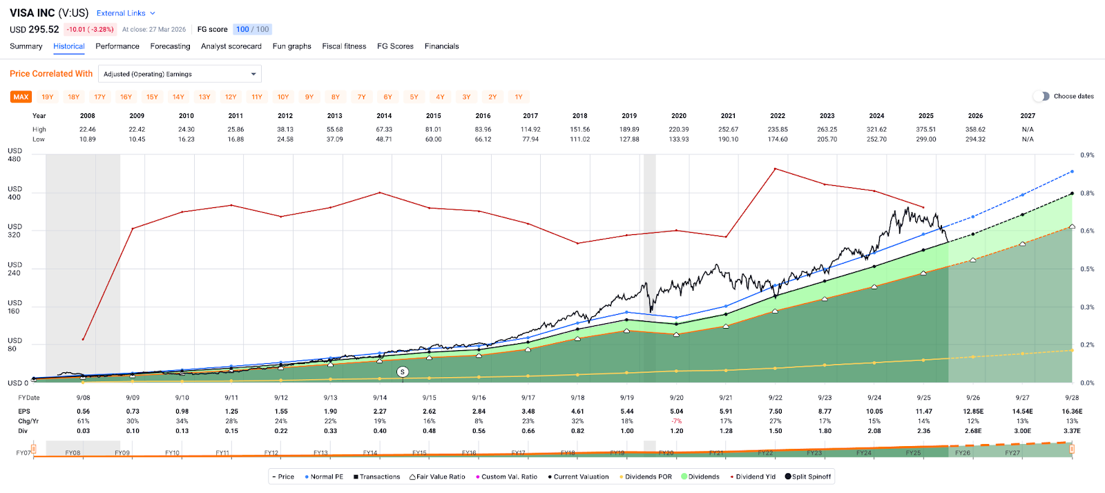
The PEG ratio is only as reliable as the growth rate you feed it. FAST Graphs gives you a precise tool for measuring historical earnings growth through the EPS CAGR calculation on the historical chart. It tells you exactly how fast the business has grown its earnings over the time period you have selected, and comparing that to the current P/E gives you an immediate read on whether today’s price is in line with the company’s track record or pricing in something very different.
Historical EPS CAGR tells you what the business has done. FAST Graphs’ Forecasting helps you think rigorously about what it might do next, which is ultimately the input that drives future returns.
You can use analyst consensus estimates as a baseline or run custom scenarios to determine best, worst, and most-likely outcomes. If the consensus expects 20% earnings growth and the stock trades at a P/E of 15, you’re paying a PEG of 0.75, a real discount to Lynch’s fair value benchmark. Run that through the forecasting calculator and you can see what that discount implies for total returns over the next few years. If the same stock trades at a P/E of 35 against 20% expected growth, the forecasting tool quickly shows how much has to go right just to justify today’s price.
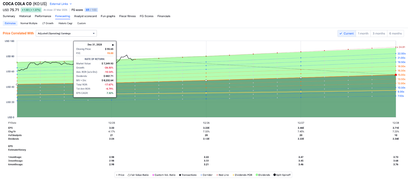
Using Coke as our example, we can see the black price line currently showing it’s trading at a P/E of 24.81 with roughly 7% expected EPS growth in each of the next 3 years.
Since EPS growth is between 5% and 15% we apply a GDF P/E of 15 as a fair value estimate for the stock. If Coke traded at a P/E of 15 and EPS growth was in line with analyst estimates through 2028, shares would be down roughly 18% from today’s price.
Warren Buffett once said he’d rather be approximately right than precisely wrong. FAST Graphs’ forecasting suite is built for exactly that kind of disciplined approximation: not predicting the future with certainty, but running the numbers through to their logical conclusion before putting capital to work.
The PEG ratio gives growth investors a framework for connecting price to value. FAST Graphs gives that framework a visual home, one where the orange line, the blue line, historical EPS growth, and forward scenarios work together to answer the question Lynch made famous: how much growth are you actually getting for what you’re paying?
Next up: FAST Graphs for Dividend Investors
Why yield alone is never enough, and the specific tools inside the platform that help income investors find stocks where the dividend is not just high, but safe and growing.
FAST Graphs™ is a stock research tool that empowers subscribers to conduct fundamental stock research deeper and faster than ever before.